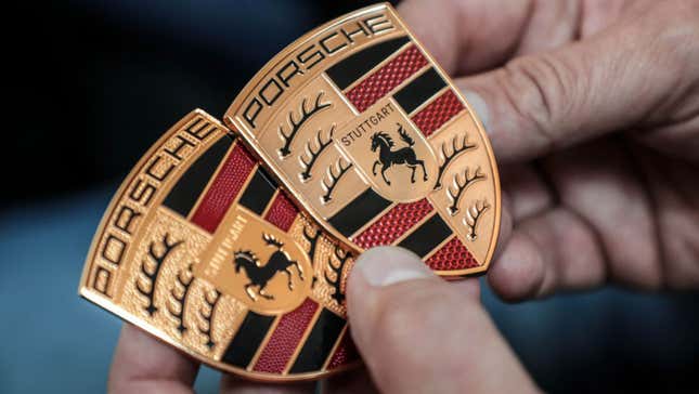
The things we regard as ubiquitous and timeless today once upon a time very much weren’t. Take the familiar Porsche crest, for instance. Sure, it’s undergone a slight freshening up as of late, but at its core it’s never really changed conceptually: a gold shield, with the rearing horse of Stuttgart’s city seal overlaid on the crest of the West German state Württemberg-Hohenzollern. This has been Porsche as far back as anyone can remember. But in the ’60s, it almost wasn’t.
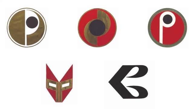
See, Porsche’s head of advertising in 1961, Hermann Lapper, as well as dealers were all concerned the gold, red and black badge was much too busy — hard to make out on a moving car in traffic and not immediately obvious on paper, where a simpler, stark black-and-white mark would have done better. So that same year the young sports car maker turned to commercial designer and frequent collaborator Hanns Lohrer for a rebrand to coincide with the launch of the 356's replacement, citing Volkswagen and Mercedes-Benz as examples to aim for. What you see above was the result.
On Wednesday, Porsche shared these designs that few have seen. Apparently they weren’t even present in the company’s extensive archive, as an official blog explains:
It is only thanks to the precision of Porsche secretary and chronicler Ghislain Kaes that we even have knowledge of these plans. Aside from this correspondence, no evidence of the efforts made at that time can be found in the company archive.
Porsche today describes these logos as “strange and even disconcerting,” which isn’t really far off the mark. The bottom-right pitch — the mirrored “P” — looks pretty slick, even if the resulting “B” shape might create some confusion. But the rest of the proposals are off the wall. What’s going on with the wrestler mask in the bottom left, or the repeating circles and crescent of the top left? The latter looks like the insignia for a cult, or a government-funded research project with more money than sense. Whatever it’s associated with, it’s bad news and probably leaking carcinogens into the local watershed.
Ultimately Porsche’s top brass didn’t like these designs either, so it dropped the plan. Ferry Porsche supposedly felt that the existing logo — even though it’d only been in use nine years by that point — was too well known to change:
A decision was presumably made that the logo that had been in use since 1952 was already too established for a sudden change of direction to be a good idea. But this is only conjecture. Ferry Porsche once made this argument when [Porsche enthusiast Dr.] Ottomar Domnick suggested to him that, with its rearing horse, the Porsche crest was too similar to the logo of the Reutter coachbuilding company.
Hindsight is 20/20 of course, but it’s safe to say more than six decades on that intuition was pretty sound. On another note, it’s amusing that the modern obsession with flat, simple logo designs for screens — which has compelled almost every automaker to opt for muted, joyless visual identities — actually goes back much, much further than the iPhone.